CyDeploy
Understanding sales through dating
The Project
Name
CyDeploy
via Harness Projects
Role
UX Designer & Researcher
Time
8 weeks
CyDeploy is B2B software that provides automated testing for cybersecurity, allowing updates to be vetted before deployment.
Our goal was to enhance the user experience and conversion rate of the CyDeploy website.
Who is CyDeploy?
I turned my empathy toward the client to really understand who they are. Keeping in mind the person-positivity bias I asked: How can I synthesize a clear understanding of who CyDeploy is and distill it concisely creating empathy and personality . . . say, the way a dating profile does for someone looking for a mate?
Person-Positivity Bias: The tendency for people to evaluate individuals more highly than a group or an inanimate object.
Discovering CyDeploy
Stakeholder Interview & Company Research
After the interview, affinity mapping was used to to identify prominent and important themes on who CyDeploy is and identify areas where things were currently unclear.
The mapping revealed to us that there were large chunks of Cydeploy’s value missing from their website. I set out to find a way to make their offerings and their values clear to potential customers visiting the website.
What makes a customer “swipe right”?
I synthesized the gathered information into a “dating app” metaphor and identified what makes CyDeploy stand out.
The Customer : The Dater
CyDeploy : One of the dater’s many potential suitors
The CyDeploy Website: CyDeploy’s dating profile
Signing up for consulation : Swiping right
Discovering the User
Who is the user?
Who is the user that is looking for a product like CyDeploy? Who is “swiping” for a security match?
Methodologies Used: Personas, SCAMPER, Jobs to be Done, Empathy Maps, User Journey Maps, Competitive Audit
User Interviews
“ I’ve seen a lot of products. They are not doing a good job in telling what is their uniqueness....What is something you do better than others? Otherwise, with so many software, how do I know which one to pick?”
“we're constantly looking to improve our processes . . .what I'm telling you now might not always be the case going forward.”
“because our staff is stretched so thinly, we'd want something that's easy to integrate, easy to implement, and easy to manage.”
Moment of Pivot:
When we were unable to get a response to the CyDeploy provided leads for interview candidates, the team pivoted to using respondent.io. I reached out and interviewed Bernard B., an Engineering Manager at the Department of Defense.
Key Takeaways
Users are looking for a clear idea of what makes a product unique
Users want something that can improve and move with the constant changes in cyber security- not just where cyber security is today
Users want something that is easy to use and implement
Aha Moment!
This came from a presentation by other team members that clarified my direction
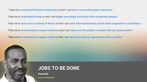
Jobs to be Done
Clarified key aspects to hone in on when working on designs
What the customer is looking to check-off before going on a “date” (consultation) with CyDeploy
Which led me to . . .
The Customer’s Profile
Design
First Impressions Count
Secondary research showed that screen viewing drastically reduces after the first fold of an individual webpage. I proposed that to keep users moving on the path towards a call to action, that we eliminate scrolls as much as possible on CyDeploy’s website.
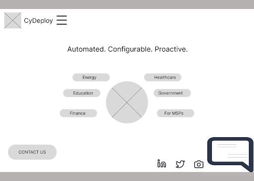
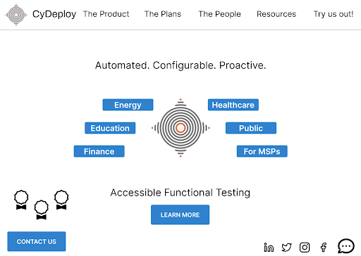
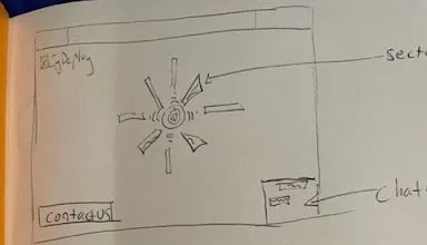
Evolution from sketch to low-fidelity prototype
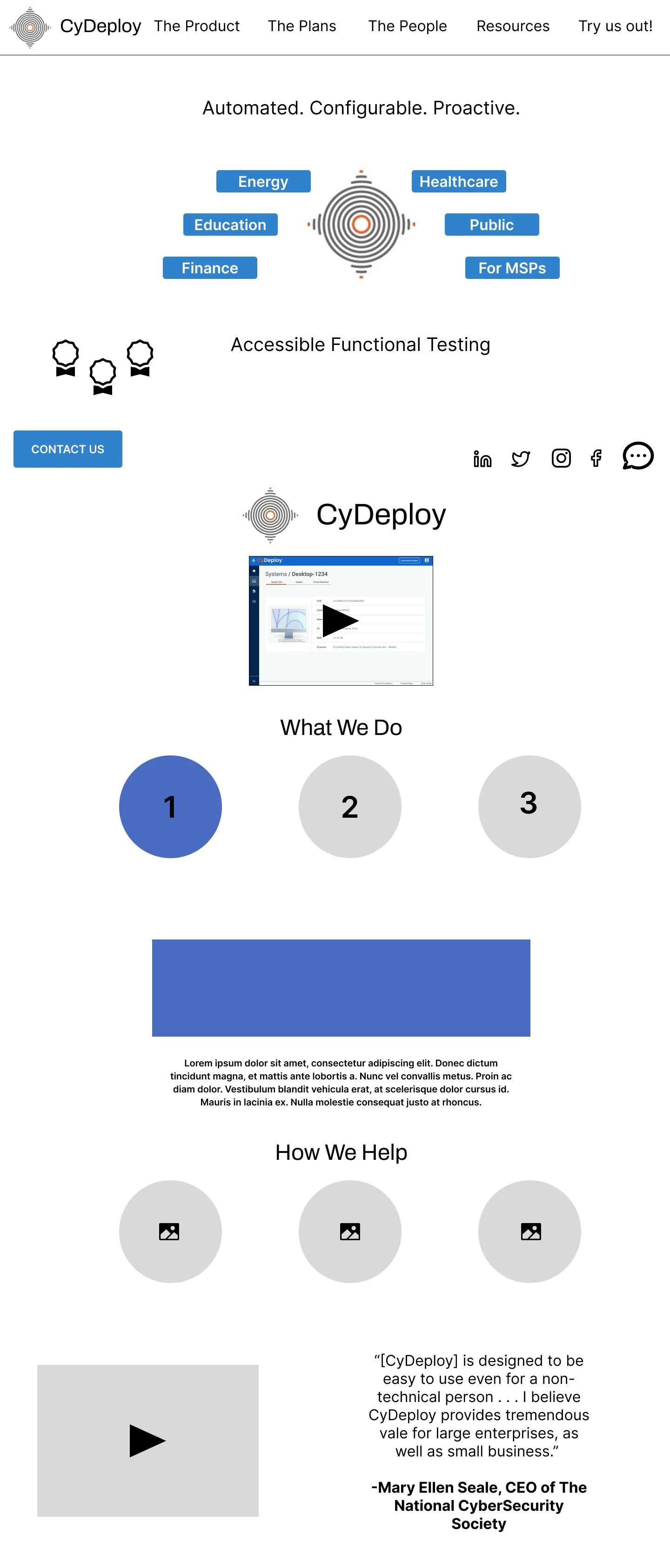
I focused in on the individual needs of the user by highlighting sectors and created copy that is concise, clear, and jumps out visually. It creates a page that is specific and tailored.
I made the website experience easy and time saving by creating clear and direct paths to any form of contact with CyDeploy.
Calls to action and buttons for contact led to separate pages, making it unclear which of the steps the user should choose. All roads now lead to one contact page where a user can email Cydeploy or schedule a consultation or demo.
By this same theory, with individualizing the entry experience with sectors, it feels personalized while leading the user to the same end space. It keeps the journey simple and direct while also feeling unique.
No more back and forth wondering when and if you will be asked out on a date, or red flags that stop you from swiping right.
Testing
Usability Test
A/B Testing on Usability Hub
I focused on the the no-scroll page but after usability testing, found that participants preferred all introductory information to be housed on one page, whether it involved scrolling or not. So I adapted the homepage and combined it with what was previously a separate page.
I also focused on what makes CyDeploy stand out as a “person” and gives it a distinct personality. I found a correlation between Tina’s personal values of outreach creating accessibility, and CyDeploy’s accessibility through its ease of use and ability to be used by companies with varied levels of IT resources. This allows the user to empathize with CyDeploy and see a clear and unique value and brand.
CyDeploy’s foundation of accessibility makes it unique:
Both through its ease of use and Tina’s personal values.
The result of the redesign? A perfect match:
Final Thoughts and Feeback
Further Examination
With more time, my next steps would include evaluating and researching design choices that are accessible. How can we adjust fonts, colors, graphics, and design choices to ensure the CyDeploy website meets usability standards for those with visual impairments (which will include the added benefit of making the site clearer for all users).
Stakeholder Feedback
“I love the analogy . . . I think that’s really helpful, to think about it in that particular context. . . That made it really digestible for me “
Tina, our stakeholder, found it helpful to “boil down” profiles this way as they begin to separate their user profiles into more sector specific examples for pitches.
Tina had further questions on how to visually integrate my suggestions on personalization. I suggested focusing on highlighting the configurability aspect of CyDeploy and how it can be used by people of different IT backgrounds.
To make my presentation clearer, I would have gone back and spent some more time on prototypes for copy, as well as incorporating layout aspects that highlight how people in different tech and non-tech roles can implement CyDeploy.


